Listen to this Article
Kaly Ryan walked into the Interior Design Show (IDS) in Vancouver with a big idea and a bigger to-do list. The founder of Capella Design wanted to build a hotel suite that worked for different bodies, abilities, and ways of moving. Not just a demo that checks the accessibility boxes, but a space people would genuinely want to stay in.
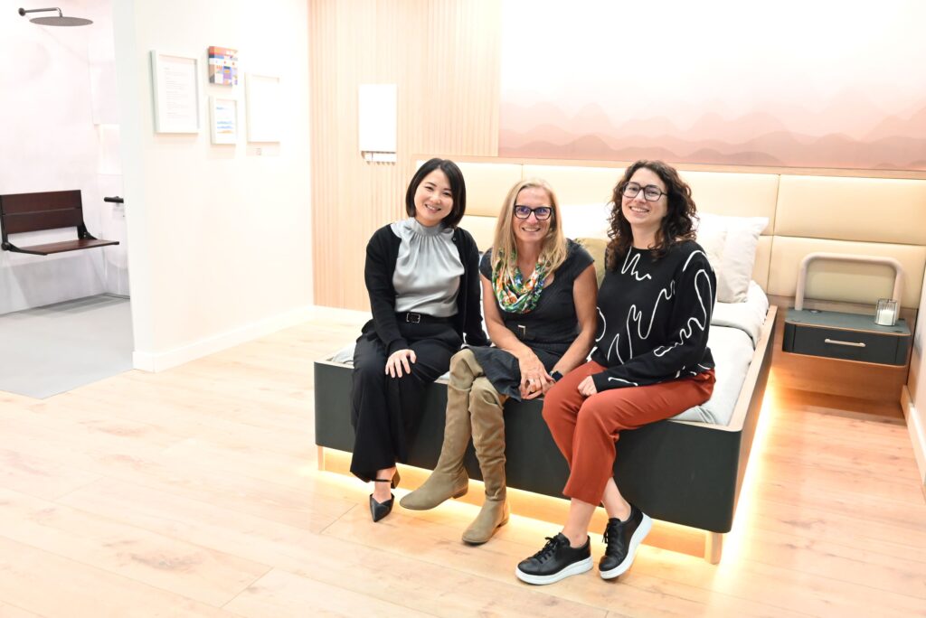
IDS Vancouver highlights the future of interior design and this year one of the themes was hotels. Ryan pitched the idea of a fully functional, stylish suite built around universal design, a space anyone could use comfortably. The show loved it and gave her the green light. Then came the fun part. Ryan assembled a team that fused professional design expertise with lived experience: an interior designer specializing in accessibility and aging in place; accessibility consultant and wheelchair user, Julie Sawchuck; advocates from the Equal Access Collective, and occupational therapists who assess how design performs in daily use. Capella also conducted a community survey, translating the feedback into a practical wish list for hotel decision-makers.
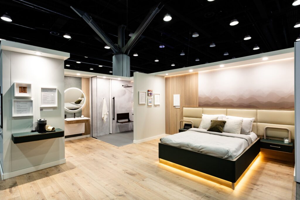
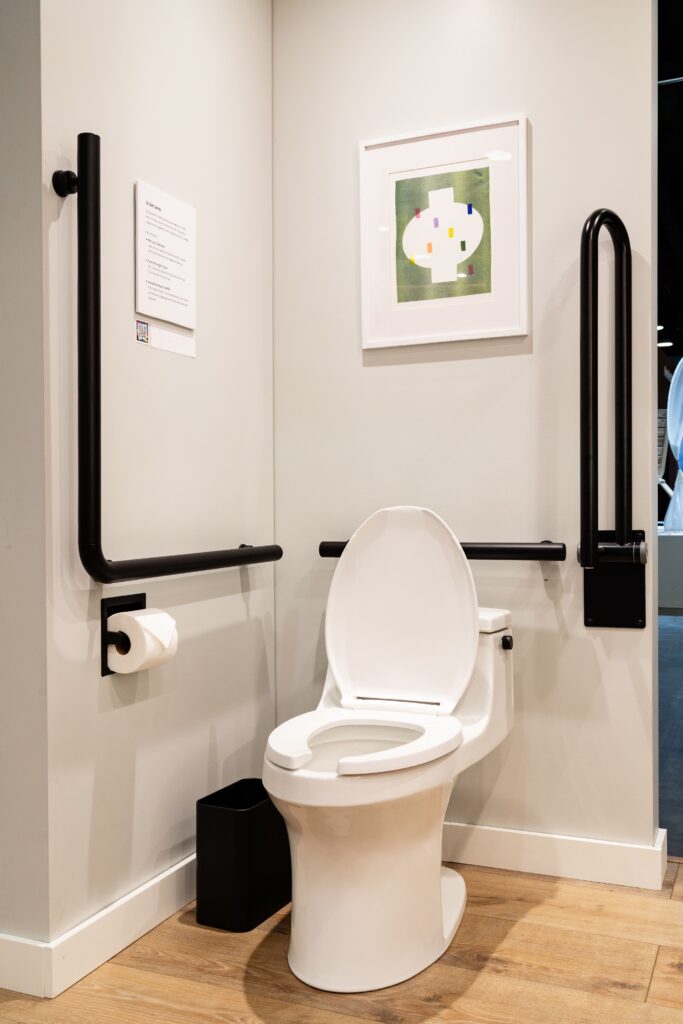
In a 20-by-16-foot setup, visitors explored a bedroom, bathroom, and shower arranged in an open, accessible layout. The shower’s level entry eliminated barriers entirely. No lip, no threshold, just a smooth, safe transition in and out. Flooring choices became part of the accessibility story. The bathroom used a textured microcement for steady footing even when wet, while the bedroom shifted to a low-ridge plank that allowed wheelchairs to roll smoothly and walkers to glide safely. The palette stayed calm and muted, but with intentional contrast where it mattered most: at doorways, around fixtures, along edges, guiding the eye and helping guests orient intuitively.
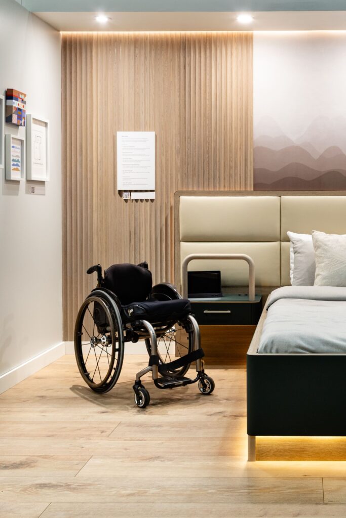
The bed quickly became a crowd favourite. Adjustable height might sound like a small detail, but anyone who’s tried to move from a wheelchair onto a tall hotel bed knows how tricky it can be. This one could move up or down from the frame itself, not just at the head or foot, making transfers much easier. There were also removable side panels on the bed frame so lifts or other equipment could slide in without hassle. Next to the bed was the unexpected star of the weekend: a pair of sleek side tables with built-in grab bars that looked like stylish furniture, not medical gear. One visitor joked that he wanted one “for after leg day.” That comment was a perfect reminder of the main idea: when spaces are designed for accessibility, everyone benefits.
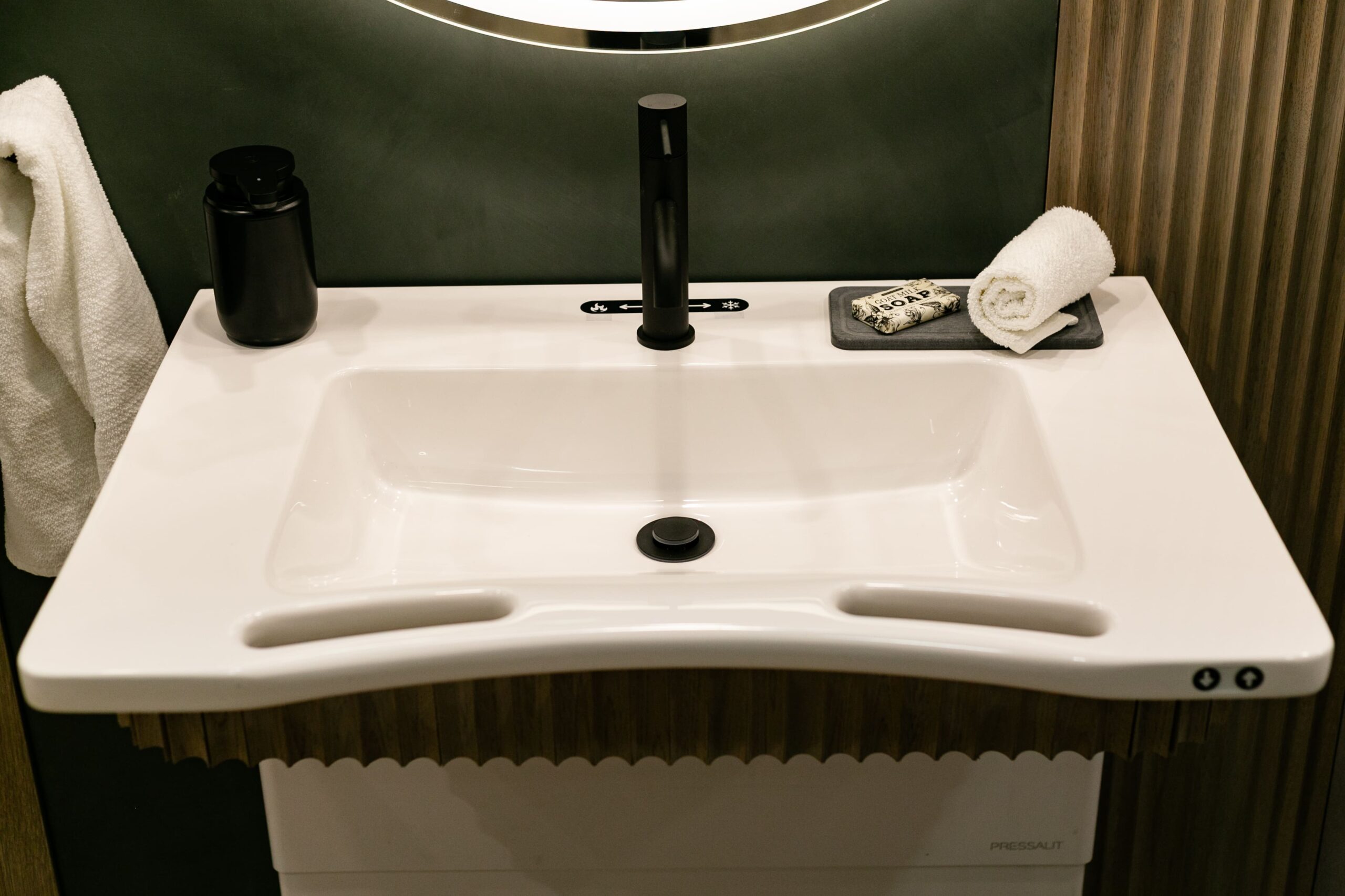
The lighting was calm and easy to adjust. Spotlights could be dimmed, and a soft glow under the bed helped guests move safely at night. Curtains and heavy doors opened with the touch of a button or voice commands, all controlled from a tablet within easy reach. The coffee bar had rounded corners for safety and was set at a height that worked for wheelchair users. Around the room, colours and textures were chosen with care so people with low vision could tell where one surface ended and another began . . . walls, floors, and fixtures all stood out from each other instead of blending into a blur of beige.
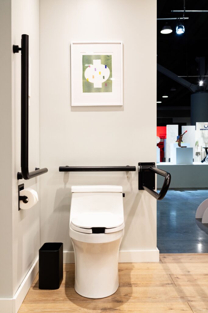
The shower ended up being the spot everyone wanted to talk about. There was plenty of room to move or transfer safely, and the grab bars stood out clearly against the light tile reaching all the way to the seat instead of stopping halfway. The hot and cold labels were big, easy to read, and even included braille. More than a few visitors admitted they’ve stood in hotel showers guessing which way to turn the handle. Not here.
The handheld shower slid up and down easily so you could adjust it with just two fingers. That way, cleaners could leave it high, and the next guest could still pull it down without any effort. The Occupational Therapists on Ryan’s team introduced what they call the “closed-fist test:” if a handle can be used with a closed fist, it works for people with limited dexterity. The shower’s long-lever controls passed with ease.
The rest of the suite was designed with comfort and calm in mind. There was no clutter or harsh glare, just soft colours and adjustable lighting so guests could set the mood and brightness to their liking. The team even thought about hearing accessibility: light strips could be connected to visual alerts, adding a gentle backup to the standard flashing alarm.
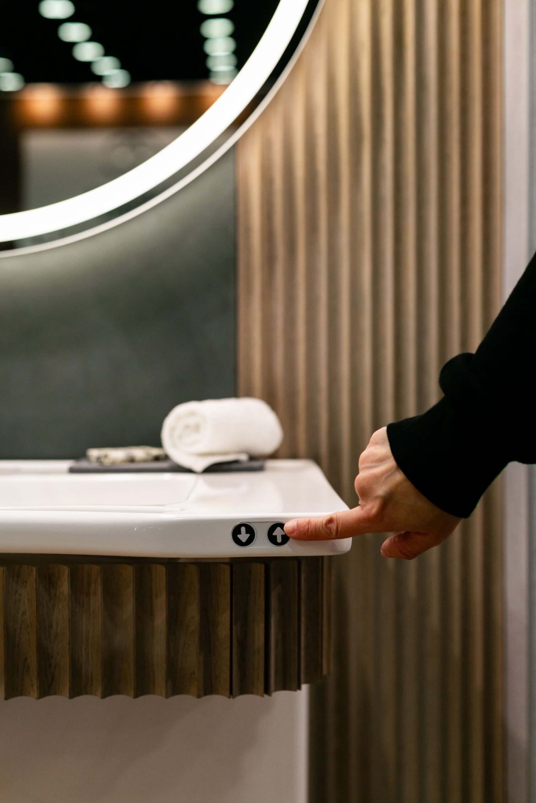
One of the biggest showstoppers was the vanity. With the push of a button, the sink could move up or down about eight inches to suit different heights. Built-in handholds on each side made it easy to steady yourself, and the curved front let wheelchair users roll in close and comfortably. Visitors were so impressed they pulled out their phones to record it in action. The technology was designed to make the space work for a wide range of bodies and abilities.
Capella’s display also gave a peek at furniture ideas for smaller living spaces. A clever side table could swing over a chair to become a desk or dining surface, keeping everything within easy reach. The chair itself sat a bit higher and had sturdy arms to make standing up or moving between seats easier. Accessibility consultant Julie Sawchuck tested the setup on the spot and gave it her approval.
The impressive display sparked curiosity about where the products could be purchased. Some were part of Capella’s own collection: a freestanding shower seat designed to look like furniture, a grab-bar frame, the adjustable side table, and a wide-handled mug with a stable base for unsteady mornings. Others, also sold through Capella’s website, came from trusted partners whose products met Capella’s standards for both function and style, like a towel bar strong enough to double as a grab bar and a hand shower with a broad, easy-to-use paddle control. The throughline was clear: durable materials, long-lasting quality, and designs built to last with no compromises on looks.
Many conversations at the booth came back to building codes. Ryan sees code requirements as the starting point, not the goal. Rules on paper don’t always match how people actually move and use a space. For example, a grab bar might technically be installed in the right spot according to the code but still be too far from the shower seat to be useful. Extending the design, even by just a few inches can make the difference between a risky transfer and a safe, easy one. It sounds simple, but it takes real collaboration with people who deal with these barriers every day to get it right.
Some people questioned the cost. Ryan’s response was straightforward: it’s cheaper to prevent an accident than to recover from one. A strong shower seat or a well-placed grab bar costs far less than a fall. She also pointed out that looks matter . . . people hang on to products they actually like. Cheap plastic aids might be functional, but they often end up in the trash, which wastes money and adds to landfill. Good design that lasts is its own kind of sustainability. So the cost, Ryan said, isn’t really about the price tag, it’s about prevention and “prevention beats recovery.”
The display also helped break some old myths. A lot of designers still think accessible design looks sterile or hospital-like, and sometimes it does, if you only stick to the same catalogs. But it doesn’t have to be that way. Capella wants to make it easier for designers to find products that look good and work well for everyone. By offering a trusted place to source from and sharing real-world insight from people with lived experience, the company is helping create spaces that are both beautiful and truly inclusive.
When asked what she’d redesign in Vancouver, Ryan points to the kinds of places people love most. Small cafés in older buildings are often community hubs, but narrow bathrooms and steps at the entrance can keep some people out. She says grants to help with upgrades would benefit everyone, not just meet accessibility rules. Even larger venues have room for improvement. Real progress, Ryan says, means making every space truly welcoming.
Capella’s motto says it all: Accessible can be beautiful and the IDS suite proved it. The space showed designers, homeowners, hotel owners, and travellers what it looks like when accessibility is part of the design from the very beginning. That kind of future isn’t far away, it’s already possible. All it takes is commitment to make it happen.
- Read more about the accessible suite and discover where to find some of the products featured in the display.
- Here’s Capella’s advice about ways you can go about Improving Accessibility with Small Changes
- Accessible Hotel Room Checklist: https://designbycapella.com/pages/ids-2025-hotel-design-guide