
Disability Resources
Explore comprehensive disability resources, including accessible destinations, services, support programs, and information for individuals with disabilities, caregivers, and advocates.
Empowering accessibility and inclusion!
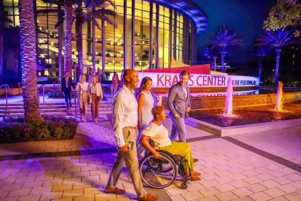
Travelers who reach The Palm Beaches discover a region that places strong focus on practical support for residents and visitors with disabilities. The county hosts a network of agencies that provide clear guidance, direct services and structured programs. Each organization approaches accessibility through concrete actions rather than slogans, which makes planning a trip or temporary stay far easier.
That network includes initiatives led by The Palm Beaches through its Certified Autism Center™ status with IBCCES, a designation that requires at least 80 percent of staff to be trained and certified in autism and sensory awareness, with ongoing education built into daily operations. This training strengthens how visitor information is delivered and how sensory-sensitive travelers are supported across the destination. The Palm Beaches has also partnered with Wheel the World, a travel platform designed for people with disabilities that checks and documents real accessibility features at hotels and attractions, such as step-free entry, room layouts and bathroom access, so travelers can book places that actually meet their needs. The partnership also supports training for local tourism businesses and helps promote properties that have been assessed, making it easier for disabled travelers to plan with confidence and fewer unknowns. In addition, the destination works with TravelAbility and Whereabout to develop a long-term Accessibility Tourism Strategy, engaging stakeholders through surveys, interviews and community feedback while embedding accessibility into tourism planning, infrastructure assessments and future destination development across The Palm Beaches.
Together, these destination-wide initiatives shape policy, training and long-term planning, but accessibility in The Palm Beaches is also supported by long-standing community organizations that deliver direct services day to day. The Arc of Palm Beach County stands among the area’s most established organizations. It offers assistance for people with developmental disabilities across several stages of life. Services include early intervention for infants, family support, adult day programs, vocational training and supported living. The Arc also maintains residential group homes within the county. Travelers looking for consistent programming or community connections can rely on these long-running supports during extended stays.
Our list of resources for you
Recommended Books
Helpful Bits
Tips for driving as an amputee – Living with limb loss often brings changes to daily routines, but it doesn’t have to mean giving up independence. Read more.
DisabilityAdvice.org offers a complementary resource designed for parents of children with disabilities, providing guidance on managing conditions such as dyslexia, ADHD, dyscalculia, and auditory processing disorder. Their guide includes actionable advice on accessing educational resources, securing financial support like SSI, and empowering families to support their children’s unique educational and developmental needs. Check out the complete guide.
Travel apps
Accessibility Consultants
Businesses Owned by People With Disabilities
Certification Courses
Deaf Talk Show Host
Disability Accessibility
Disability-Serving Organizations
Employment
Hospitality Training
Travel and Tours
Accessible Travel Consultants
Adaptive Clothing
Inclusive Employers
Global PWD Community
Learning
Media
Outdoor Activities
Products & Accessories
Web Accessibility
Easter Seals Canada
Inspired by the formation of the National Society for Crippled Children (later Easterseals) in the US three years earlier, Easter Seals in Canada had its beginnings in the province of Ontario on November 28, 1922, when 10 representatives from seven Rotary Clubs throughout the province came together to form the Ontario Society for Crippled Children (later Easter Seals Ontario). As was the case with their US counterpart, this organization’s concern was the lack of services and resources available to children with physical disabilities, and its goals were to ensure adequate treatment and raise public awareness about the needs of these children. Over the next 34 years, similar organizations that would eventually become part of the Easter Seals family were established across Canada. In 1937, the Ontario Government turned to Easter Seals for expert assistance following a devastating poliomyelitis (polio) outbreak. That same year, Easter Seals in both Ontario and Nova Scotia opened the first Canadian adaptive camps for children with physical disabilities. Today, Easter Seals and its ten independently governed provincial affiliate organizations have offices and provide programs and services to people living with disabilities in provinces and territories all across Canada.
Essential Guide for Families of Children with Disabilities
DisabilityAdvice.org offers a complementary resource designed for parents of children with disabilities, providing guidance on managing conditions such as dyslexia, ADHD, dyscalculia, and auditory processing disorder. Their guide includes actionable advice on accessing educational resources, securing financial support like SSI, and empowering families to support their children’s unique educational and developmental needs. Check the complete guide here: disabilityadvice.org/child-disability/
For USA veterans and military men in service
This is a comprehensive directory of alcohol and drug rehab centers in the USA that can help on the road to recovery. Click here.