
Listen to this Article
What you notice, or do not notice in the aisle often determines how easy a product will be to use at home. It usually starts with something small. You reach for a bottle in the shower and pause. Is it shampoo or conditioner? The labels look nearly identical. Later, you try to open a new product and the lid refuses to budge. Another day, you find yourself squinting at instructions that feel smaller than they need to be. These moments are easy to overlook, but they often become daily barriers rather than minor inconveniences. For people living with disabilities, whether visible or invisible, these small points of friction can make everyday routines easier or harder to manage independently. Inclusive product design plays a critical role in reducing these points of friction and improving usability.
At Procter & Gamble, accessibility is increasingly being considered across a wide spectrum of needs as part of designing products that work well in real-life situations. This includes people with physical disabilities such as arthritis, multiple sclerosis, or spinal cord injuries that affect strength and dexterity; people with visual impairments who rely on touch or contrast; individuals with cognitive or learning disabilities who benefit from clarity and structure; and those with sensory sensitivities who respond to texture, sound, or visual simplicity. It also includes people with temporary disabilities, chronic fatigue, or fluctuating conditions that change from day to day.
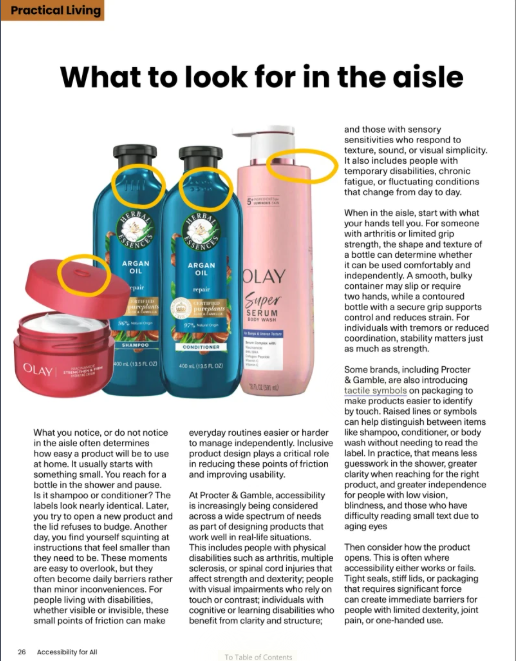
When in the aisle, start with what your hands tell you. For someone with arthritis or limited grip strength, the shape and texture of a bottle can determine whether it can be used comfortably and independently. A smooth, bulky container may slip or require two hands, while a contoured bottle with a secure grip supports control and reduces strain. For individuals with tremors or reduced coordination, stability matters just as much as strength.
Some brands, including Procter & Gamble, are also introducing tactile symbols on packaging to make products easier to identify by touch. Raised lines or symbols can help distinguish between items like shampoo, conditioner, or body wash without needing to read the label. In practice, that means less guesswork in the shower, greater clarity when reaching for the right product, and greater independence for people with low vision, blindness, and those who have difficulty reading small text due to aging eyes
Then consider how the product opens. This is often where accessibility either works or fails. Tight seals, stiff lids, or packaging that requires significant force can create immediate barriers for people with limited dexterity, joint pain, or one-handed use. Flip-top caps, pumps, and easy-twist designs are functional solutions that support independence for people with mobility-related disabilities, as well as those recovering from injury or managing chronic conditions in everyday use.
For people with visual impairments, recognition is a critical part of usability. In many homes, products look and feel the same. Being able to distinguish between items can reduce risk and increase confidence. Subtle differences in shape, texture, or tactile symbols can help someone identify shampoo versus conditioner, or face cream versus body lotion, without assistance.
Technology is also starting to bridge gaps that packaging alone cannot. Tools like NaviLens allow users to scan specially designed codes on products using a smartphone, even from a distance and without needing to focus precisely. For someone with low vision or blindness, or someone who does not speak the native language, this can help make the shopping experience more navigable. Instead of picking up each item to read a label, a shopper can scan the shelf and hear product information read aloud in their native language. In a busy store, that means less reliance on assistance and more control over choices. At home, the same technology can help identify products quickly, confirm instructions, or differentiate between similar items stored side by side.
Clarity is equally important for people with cognitive or learning disabilities. Instructions that are overly complex, cluttered, or difficult to read can create confusion and slow down routines. Clear, high-contrast text and straightforward directions make products more usable for individuals with dyslexia, memory challenges, or processing differences, while also benefiting anyone navigating a busy day.
Accessibility also extends to behaviour and routine. The Oral-B Disney Magic Timer is a useful example. While it is designed for children, its structure supports a broader range of needs. For children with developmental disabilities, including autism or ADHD, the app provides visual cues, timing, and predictable steps that make brushing easier to complete. For parents, it reduces the need for constant prompting. For adults who rely on routine or external reminders, particularly those managing cognitive fatigue or executive functioning challenges, it offers an additional tool to help stay on track.
Laundry is another area where design choices can either add effort or remove it. Traditional detergent bottles can be heavy, awkward to pour, and difficult to measure accurately, especially for someone with limited strength, joint pain, or coordination challenges. Newer formats, including lightweight detergent tiles or pre-measured pods, reduce the need for lifting and pouring altogether. For someone with arthritis, that can mean avoiding strain on the hands and wrists, while pre-measured formats remove the guesswork of dosing for those with visual impairments. Simplifying a multi-step task like laundry can also make routines easier to manage for individuals dealing with fatigue or cognitive overload.
Sensory considerations also play a role. Products that are overly fragranced, visually cluttered, or physically difficult to handle can create discomfort for individuals with sensory sensitivities. Simpler packaging, clear layouts, and predictable design can help reduce that overload.
Across categories, from personal care to household cleaning, these design choices support a wide range of people. A laundry product that is lightweight and easy to handle can benefit someone with limited mobility. A bottle with tactile symbols can support someone with low vision. A pump dispenser can make personal care products usable for someone with one-handed mobility. These are not niche features but practical solutions that reflect how people actually live and use products in everyday settings.
There is also value in consistency. When products follow a familiar design pattern, they become easier to recognize and use over time. This can reduce the need to relearn tasks for those with memory challenges or cognitive fatigue, helping support routine over time.
Next time you are in the aisle, take a moment to look beyond the label. Pick up the product, try the lid, notice the shape, the texture, how easy it is to understand. Small details may seem insignificant in the aisle, but at home, they shape how comfortably and independently products fit into day-to-day routines.