Listen to this Article

Some companies are beginning to treat accessibility less as an added feature and more as a core design principle, shaping how everyday products are imagined, tested and improved. At Procter & Gamble (P&G), that approach is increasingly embedded in how products are developed and brought to market.
Behavioural research leader Amy Delgado, along with her team, focuses on understanding how people actually live, and that starts with how research is conducted. Rather than relying heavily on what consumers say, Delgado’s team prioritizes observation. Watching how someone shops, handles packaging or completes a routine often reveals more than asking them to explain it. For example, in a store aisle, a person might pick up a bottle, turn it over, squint at the label or hesitate longer than expected. Those small behaviours signal friction points that traditional research can miss. People may not always know why they’re doing something, Delgado explains. But when behaviour is observed, it becomes easier to understand what is actually happening.
This approach has become especially important in accessibility work, where barriers are not always obvious and are rarely the same for everyone.
Where design meets independence
For Delgado and her team, accessibility is closely tied to dignity and independence. When a product is difficult to use, the impact goes beyond inconvenience. It can mean needing help for something that should be simple, which affects how a person moves through their day. It can limit a person’s ability to function independently, making everyday routines harder to complete on their own Conversely, reducing friction in everyday routines can support greater ease, independence, and usability in daily tasks.
Her perspective is shaped not only by her role but by lived experience. As a parent of a child with spina bifida, she has seen firsthand how design decisions influence independence. Products that can be used one-handed from a seated position or with minimal strength can change what is possible in everyday life.
That thinking reflects a broader approach to design. When something is easier to use, it benefits everyone. It supports someone managing chronic pain, a parent holding a child, an older adult with reduced strength or anyone navigating a busy moment.
Designing beyond the “average user”
Inside the company, teams are increasingly challenged to design beyond a narrow definition of the “average” user. One way this happens is through simulation. Product teams use tools that mimic limited dexterity or reduced mobility, forcing them to complete everyday tasks under constrained conditions.
Opening packaging, applying a product or completing a routine becomes noticeably more complex when you can only use one hand or cannot grip properly. In some cases, people resort to using their teeth to open something, not because they want to, but because the design leaves them no other option.
The product team engages with these moments deliberately to understand real consumer challenges. Once experienced, they tend to stay with designers, influencing how future products are developed.
Importantly, these scenarios also reflect situations many people encounter at different moments in everyday life. Many people experience similar constraints temporarily or situationally such as when carrying groceries, managing fatigue or multitasking. Designing for those moments often leads to better solutions across the board.
Rethinking the store aisle
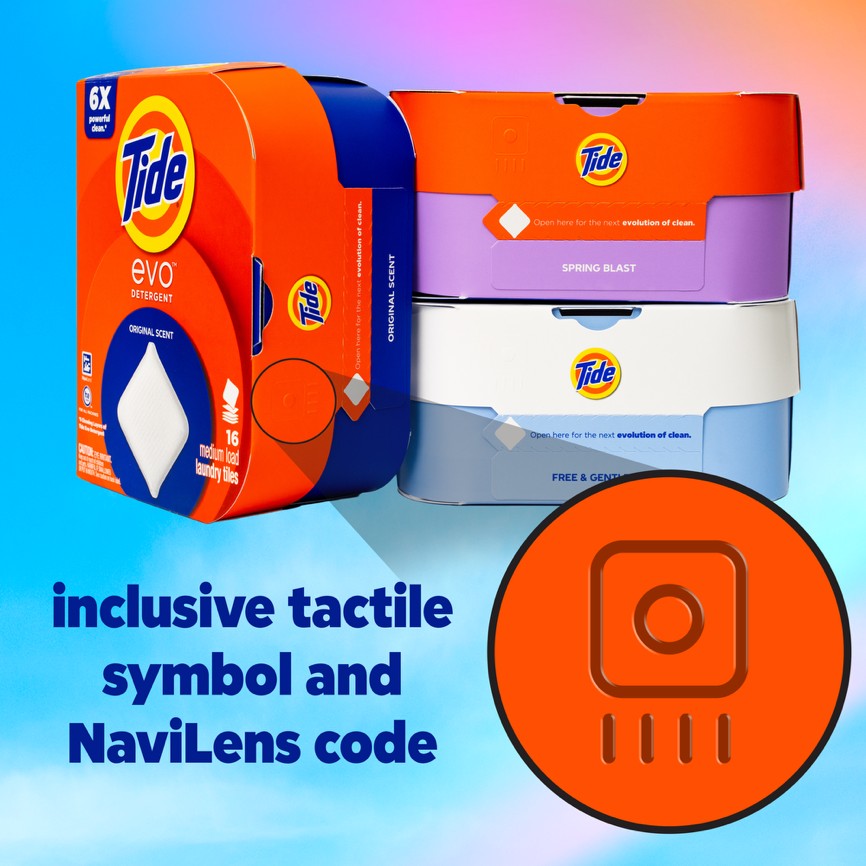
Accessibility challenges often begin before a product is even picked up. For someone with low vision, navigating a store aisle can be a barrier in itself. New tools are starting to address that. Tide Evo, one of the company’s recent launches, incorporates NaviLens technology, a system designed to be detected by a smartphone from a distance. Unlike traditional QR codes, which require precise alignment, NaviLens can help guide you to a product by using sound and simple directions on your phone.
At the same time, more traditional design elements still matter. Packaging with stronger contrast, larger text and clearer layouts can make a significant difference for people with aging vision or low sight.
Packaging that responds to real needs
Once a product is in hand, physical interaction becomes the next challenge. Opening packaging, lifting containers or dispensing product can be difficult for people with limited strength, dexterity or chronic pain.
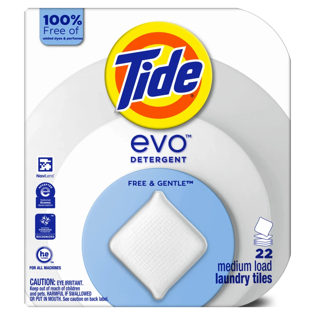
Here, product design becomes tangible. Tide Evo moves away from heavy liquid bottles in favour of lightweight recyclable paper packaging containing and dissolvable detergent tiles. The packaging opens with a simple pull tab, requires minimal effort to handle and includes a tactile symbol to help identify it as a laundry detergent by touch.
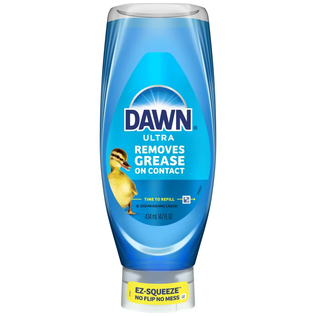
Other products reflect similar thinking. Dawn EZ-Squeeze removes the need to invert a bottle and open a cap, allowing the user to dispense soap with a simple squeeze. Head & Shoulders BARE uses a more flexible bottle to help more easily squeeze out the last drop.
Even small adjustments, like clearer tear points or improved perforations, can make a noticeable difference, particularly for older adults or those with reduced grip strength.
Making products easier to understand
Clarity is another key focus. Instructions that rely on dense text or complex language can be difficult to follow, particularly for people with cognitive differences, as well as non-native speakers or those with lower literacy levels. The approach is to simplify by reducing text, using pictograms and presenting information in a way that is easier to process. Clear, straightforward instructions rely on very few words but remain easy to understand, helping a wider range of people use products more easily and with greater clarity..
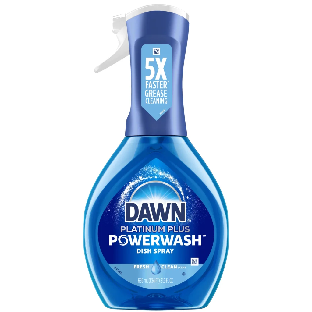
Dawn Powerwash offers a straightforward example with instructions reduced to spray, wipe, rinse. Unnecessary steps are removed which allows the user to understand the product quickly. This kind of design improves usability for a wide range of people, not just a specific group, by reducing unnecessary complexity and making information easier to process.
Designing without relying on language
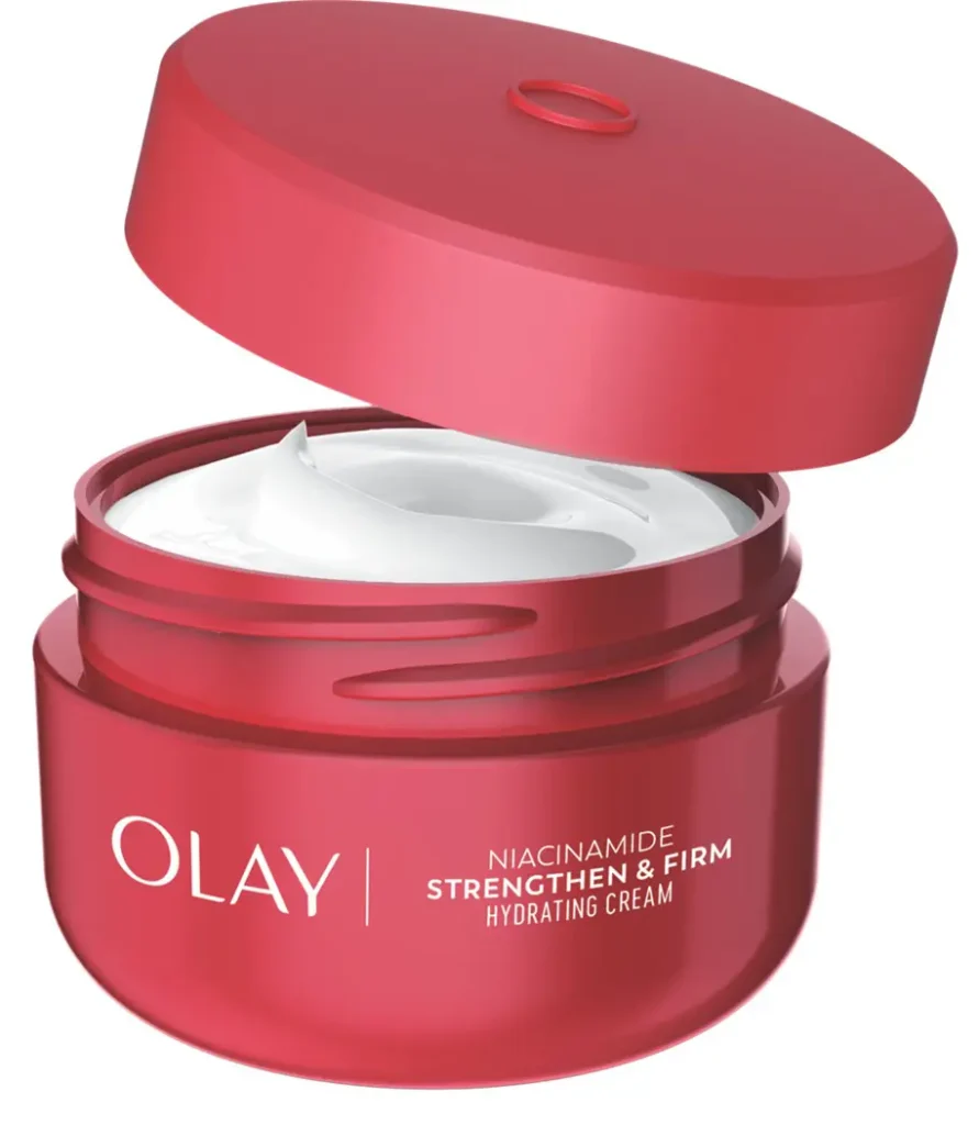
In global markets, accessibility introduces additional challenges. Language, literacy, blindness and cultural differences all affect how products are used. To address this, the company has developed tactile symbols for packaging. These raised symbols allow products to be identified by touch rather than text, a design choice informed by the needs of the blind and visually impaired community and also helpful for people with aging vision who may have difficulty reading small text on packaging. Simple patterns, such as lines for cleaning or dots/circles for moisturizing, correspond to different product types and are designed to be intuitive. The goal is consistency across regions. A person should be able to recognize a product regardless of where they are, without needing to read or translate information. These can be found on Tide evo, Olay body wash and Herbal Essences amongst other brands.
Design informed by real-world use
A consistent theme across this work is designing products based ono how they are used in real-world situations. Internal employee networks and external research participants play a role in shaping product design, offering insights that cannot be captured through assumption alone.
These perspectives help teams identify challenges earlier and design with a broader range of needs in mind. They also reinforce a key idea: accessibility is not a one-time solution. It is an ongoing process that evolves with better understanding.
A shift in expectations
What emerges from this ongoing work at P&G is a shift in how accessibility is viewed. It is no longer positioned as a specialized feature or an add-on but part of designing products that function well in real life.
When packaging opens easily, instructions are clear and products are simple to identify, the benefits extend beyond any single group. They create smoother, more intuitive experiences for everyone. In that sense, inclusive design is about designing products that work better in real-life situations for a broad range of people.